Your Content, Optimized. Your Brand, Elevated.
Colours and their impact on your brands perception
Discover how colors shape mood, perception, and engagement in photography and web design. Learn how to use color effectively to enhance brand identity and user experience.
10/11/20254 min read
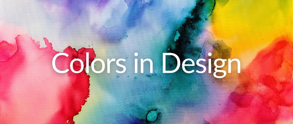
The Role of Color in Design: Supporting Mood, Perception and Engagement
Color is one of the most immediate ways design communicates. Whether you’re crafting a visual story through photography or building a website, color shapes how people feel and how they understand a brand.
Although color responses are influenced by culture and personal preference, research shows that color choices can support emotional comfort, attention, and user satisfaction. For designers, photographers and web designers, understanding color psychology is essential to creating emotionally resonant and visually engaging experiences.
What the Research Suggests
Research in environmental and design psychology shows that color can influence how people perceive and interact with their surroundings (Küller et al., 2009; Barrett et al., 2013).
These effects aren’t absolute or purely biological — they depend on context, lighting, and what people expect from a brand or environment (Elliot & Maier, 2014).
For example, in digital design, muted tones and low contrast can convey calm professionalism, while vibrant hues can evoke creativity and energy. In physical or online environments, thoughtful color use contributes to both performance and well-being.
Color, Behavior, and Experience
Color functions as both a psychological signal and a sensory experience. It directs attention, reduces visual monotony, and reinforces the purpose of a space or screen.
High contrast improves visibility — essential in both photography composition and website navigation.
Balanced color palettes support focus and readability in learning or work environments.
Warm or vibrant hues encourage social interaction — ideal for lifestyle, community, and creative brands.
In both photography and web design, color should be applied with intention, aligning visual tone with emotional and behavioral goals. The right palette doesn’t just look appealing — it enhances usability, engagement, and brand identity.
The Effects of Specific Colors
Below are insights from Dr. Oscar Brunler and general associations drawn from psychology and visual culture — valuable for both photographers and web designers seeking to strengthen brand identity through color:
💛 Yellow: Increases cheerfulness.
Associated with optimism, brightness, cheer, but can also be visually tiring in large amounts or high intensity.
💚 Green: Universally associated with peace; light greens for balance
Commonly tied to nature, renewal, balance and tranquility. Good for spaces or visuals meant to feel restful or supportive.
💎 Light Blue: Cooling and soothing, reduces tension.
Frequently linked to calm, stability, trust, and concentration.
💙 Dark Blue: Calming to the nerves, can induce restfulness and sleep.
💜 Violet and Mauve: Strengthen mental focus, calm the nervous system encourage abstract thinking.
Often linked to royalty, luxury, creativity and wisdom. It can convey sophistication and imagination.
💗 Pink: Frequently associated with tenderness, care, sweetness and affection. It can feel nurturing and gentle — though in some contexts it may also signal childishness or immaturity.
❤️ Red: Exciting and energizing, helpful for lifting a low mood, though potentially overwhelming for some,
Often associated with energy, urgency, power, passion or dominance.
🧡 Orange: Releases tension, restores balance, and vitality.
Commonly tied to energy, warmth, optimism, spontaneity and social interaction.
🤎Brown: Grounding, supportive for decision-making and concentration, useful in work and boardroom settings.
🖤 Black: Often associated with elegance, sophistication, authority, and power. It can convey mystery, seriousness, or formality, depending on context.
🤍 White: Commonly associated with purity, cleanliness, simplicity, and peace. It can convey openness, minimalism, or neutrality, depending on context.
Color and Culture in Design
This is not a cultural analysis or a definitive representation of any of the cultures listed below.
It’s a simplified overview highlighting common associations across regions — a quick reference for photographers and web designers working with global audiences.
💛 Yellow
Asia: China – Royalty, prosperity, power.
South America: Colombia – Sunshine, warmth.
Africa: Nigeria (Igala) – Wealth, royalty, prosperity in traditional cloth.
Western cultures: Optimism, friendliness, caution.
💚 Green
Asia: Indonesia – Fertility, nature, life.
South America: Brazil – Growth, vitality, nature.
Africa: South Africa – Land, fertility, natural wealth.
Western cultures: Nature, health, growth, renewal.
💎 💙 Blue
Asia: India – Divinity, calm, spirituality.
South America: Chile – Trust, calmness.
Africa:
Berber (North Africa), Yoruba (West Africa), Bwa (West Africa), Mozambique – Peace, protection, connection to the divine; used to ward off evil spirits.
Western cultures: Trust, stability, professionalism (common in corporate branding).
💜 Purple
Asia: Thailand – Mourning color for widows (traditional).
South America: Peru – Luxury, high rank.
Africa:
Kenya (Masaai) – Healing and spirituality.
Nigeria (Yoruba) – Marks significant life events.
Western cultures: Royalty, ambition, creativity, luxury.
💗 Pink
Asia: Japan – Femininity, softness, youth.
South America: Brazil – Romance, playfulness.
Africa: Ghana (Akan) – Pure love, tenderness, nurturing, fresh start.
Western cultures: Sweetness, nurturing, affection.
❤️ Red
Asia:
China – Luck, happiness, prosperity; used in festivals and weddings.
India – Purity, beauty, and marital status (brides often wear red).
Africa:
Yoruba (Nigeria) – Vitality, courage, life force (“pupa” in beadwork and textiles).
Ashanti (Ghana) – Sacrifice and passion (represented in the national flag).
Western cultures: Warning, danger, urgency, passion.
🧡 Orange
Asia: India (Saffron) – Courage, sacrifice, purity, spirituality.
South America: Ecuador – Harvest, vibrancy, celebration.
Africa: South Africa – Land, fertility, natural wealth.
Western cultures: Energy, creativity, enthusiasm, warmth.
🤍 White
Asia: China – Mourning, death, loss.
South America: Argentina – Peace, openness.
Africa: Ndebele (South Africa/Zimbabwe) – Used in ceremonial and decorative art.
Western cultures: Purity, weddings, minimalism, simplicity.
When choosing brand colors, consider not just what looks good, but what feels right for your target audience’s cultural and emotional context.
Applying Color Psychology in Photography and Web Design
For photographers and web designers, color is storytelling.
It influences how users feel when they land on your page or view your images. Here’s how to use it strategically:
Photography: Use color grading to evoke mood — soft greens for tranquility, rich reds for passion, cool blues for professionalism.
Web Design: Align color palettes with your brand’s emotion and purpose. For example, a wellness website might use pastel blues and greens, while a creative agency might opt for bold oranges or purples.
Brand Identity: Keep consistency across website, logo, and photography for instant recognition and trust.
Conclusion
Color is more than decoration — it’s a powerful design language that communicates emotion, purpose, and identity.
For photographers and web designers, mastering color psychology helps you create visuals and digital experiences that not only look beautiful but also connect deeply with audiences across cultures.
References
Barrett, P., Zhang, Y., Moffat, J., & Kobbacy, K. (2013). A holistic, multi-level analysis of classroom design and learning outcomes. Building and Environment, 59, 678–689.
Küller, R., Ballal, S., Laike, T., Mikellides, B., & Tonello, G. (2009). The impact of light and color on psychological mood and performance. Journal of Environmental Psychology, 26(2), 219–231.
Elliot, A. J., & Maier, M. A. (2014). Color and psychological functioning: a review of theoretical and empirical work. Frontiers in Psychology, 5, 368.
Birren, F. (1978). Color Psychology and Color Therapy.
Contact
Connect with me.
Privacy Policy
© 2025. All rights reserved.
contact@myseastudio.com
Returns Policy